There's a reason the blank white page is a cliché for creative block. White paper is, visually, empty — and empty is intimidating. The moment the page has a color on it, it's not empty anymore, and your first mark stops being the creation of something from nothing and becomes a response to something that's already there. That shift is small and enormous at the same time. This is why it matters.
The blank page problem
Every artist I know has stared at a white page and felt the weight of it. Writers have been studying blank-page anxiety for decades and the pattern is consistent: a perfect empty surface increases procrastination, reduces risk-taking, and makes the first mark feel higher-stakes than it should.
White paper amplifies this because it signals purity and permanence — you can't touch a white page without marking it. A colored page is already marked. The paper has made the first move. Your job is to respond, not conjure.
What color does to the drawing brain
A colored ground changes drawing in three concrete ways.
1. It compresses your value range
On white, you have to build every midtone from scratch. On a midtone ground, the paper is the midtone — you only draw what's lighter or darker. This is the oldest trick in classical drawing. It's why so many Renaissance master drawings are on prepared brown or red paper. You save time and produce more confident value relationships.
2. It forces color decisions earlier
On a white page, you can defer color. On a green page, you can't — every color you put down is in conversation with green from the first stroke. That sounds like a constraint. It functions like a creative unlock. Constraints force decisions, decisions produce work.
3. It lowers the stakes
A premium white page feels precious. Expensive. Blank. Waiting to be ruined. A colored page feels like something you can play on. The same sketch that feels tentative on white feels looser on orange. The preciousness gets transferred onto the art, for better or worse. Pick your poison.
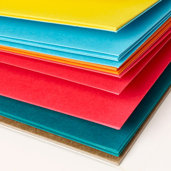
What specific colors do
Different colors do different things. This is less about formal color psychology and more about what I've seen happen over time, both in my own work and watching other artists.
-
Warm neutrals (tan, beige, ochre). Flatter natural subjects. Calm, easy to start on. Best for portraits and landscape.
-
Cool neutrals (gray, sage, slate). Lower emotional temperature. Good for observational and architectural work.
-
Brights (orange, magenta, lime). Raise energy. Force decisive, playful, graphic mark-making. Kill subtlety — which is sometimes exactly what you need.
-
Pastels (pink, mint, lavender). Soften everything. Good for gentle subjects and delicate line work.
-
Black and deep tones. Flip the logic — you're drawing with light instead of against dark. White pencil and gel pens become your main tools.
The permission angle
The most valuable thing a colored page does is give you permission to make a bad drawing.
A white page feels like it deserves a good drawing. A bright magenta page doesn't feel like it deserves anything — it's already weird, so you can be weird with it. This is the quiet reason colored paper works so well for practice, for sketchbooks, for the kind of drawing you're trying to loosen up about.
Our tagline — beauty has no rules — is really about this. A colored page is an invitation to stop trying to make what's inside the notebook worthy of the notebook. Once that pressure's gone, what comes out is usually better.
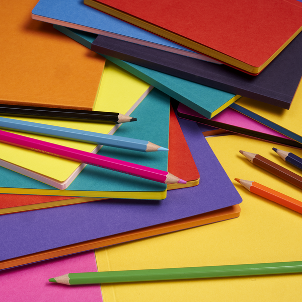
An exercise
For a week, don't draw in your usual sketchbook. Use a colored pocket sketchbook (ours are Uglybooks) — any color, any brand — and draw only what you were going to draw anyway. At the end of the week, compare those sketches to the previous week's on white. Two things you'll notice:
-
The colored sketches are looser. Your mark-making got more confident and less careful.
-
You made more of them. Lower stakes produced more drawings, not fewer.
Both are the point. Colored paper isn't a magic upgrade to your work. It's a reduction in the friction between you and the page. Over enough pages, that friction reduction adds up to a lot more drawings — which is what actually makes you better.