White paper is the default. It's not always the right call. Colored paper changes how you draw from the first mark — sometimes that's a gift, sometimes it's a distraction, and the honest answer is that both have their place. Here's how to pick the right one for what you're actually making, without the zealotry you usually get when people write about this.
The short answer
White paper is for finished work you want to reproduce. Colored paper is for thinking, practicing, and making things that feel alive. Most working artists use both.

What white paper is actually good at
White paper has three things nothing else can match.
-
Reproducibility. If the drawing's going to be scanned, printed, or reproduced, a white background gives you the widest possible tonal range when you adjust it digitally. Colored paper closes off some of that range before you've started.
-
Full tonal range. On white, you can go from paper-white (brightest) to pure black (darkest). On a midtone ground, your lightest value is whatever white pencil or gouache you put down — which is always slightly less bright than actual paper white.
-
Predictability. Every color you put down behaves the way you expect. Red on white looks like red. Red on green paper looks different — sometimes interesting, sometimes not what you wanted.
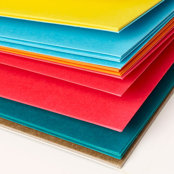
What colored paper does that white can't
-
It gives you a midtone for free. On white, you have to render every middle value. On a midtone ground, the paper is the midtone — you only add what's lighter or darker. This is the oldest trick in classical drawing for a reason.
-
It kills blank-page anxiety. A blank white page is intimidating. A page that already has a color has already started — your first mark is a response to something, not the creation of something from nothing. This matters more than it sounds.
-
It forces better color decisions. When your ground is already orange, every color you put down has to work with or against the orange. You stop reaching for the same safe palette and start thinking.
-
It flatters subjects white paper doesn't. Warm skin tones look better on warm-toned paper. Landscape greens sing on earth tones. White gel pen on black paper is its own visual language.
When to use which
Use white paper when
-
The drawing's going to be reproduced, printed, or scanned professionally.
-
You're doing a finished piece with a full tonal range.
-
Color accuracy matters more than atmosphere.
-
You're working in a medium where the paper white acts as the light source.
Use colored paper when
-
You want the midtone built in.
-
You're sketching for yourself, not for reproduction.
-
You want to lower the stakes and just draw.
-
The subject has a natural tonal environment — dusk landscape on blue, skin on warm tan, graphic illustration on bright.
-
You're tired of white paper and your process needs unsticking.
A practical experiment
If you're stuck on this question, here's the fastest way to answer it for yourself. Take the same subject — a mug, a plant, anything in front of you — and draw it three times. Once on white. Once on a warm midtone like tan or ochre. Once on a saturated color like orange or green. Same pencils for all three. Compare them when you're done.
Here's what you'll see: the white version shows your drawing ability most clearly. The midtone version is probably the most atmospheric. The saturated version is the most decisive — you can't hide in subtle values on a bright, so every mark has to commit to something. There's no failing this. It's the fastest way to understand what colored paper actually does for your work.
The verdict
Use both. White for finished work and anything heading for reproduction; colored for practice, thinking, and subjects that benefit from an atmospheric ground. Most working artists I know keep at least one sketchbook of each and rotate depending on what they're making.
If you've never worked on colored paper, the lowest-stakes way in is a small pad or a pocket sketchbook. I'd start with Uglypads Earth Tones — the palette is forgiving, flatters most subjects, and doesn't shock you the way a saturated bright does. Once you're comfortable there, branch into brights or pastels based on what you actually draw.