Earth tones are the oldest colored paper palette in the book. Tan, ochre, clay brown, sage green, slate gray — the colors of actual earth, which is exactly why they work so well for the subjects that come from the earth. Landscape. Still life. Portraits with warm skin tones. Anything you'd paint outdoors. Here's why earth tone paper has lasted 500 years and how to actually use it.
What "earth tones" means
Earth tones are muted, warm-leaning colors that reference natural pigments — iron oxides, ochres, umbers, siennas. The historical pigments ground from actual earth. A warm beige is a stand-in for raw canvas or weathered bone. A clay brown is a stand-in for terracotta. A sage green is a stand-in for lichen or aged bronze. Earth tone paper uses these colors as a midtone ground for drawing, which means you're working with a base that already feels like something — not artificial, not graphic, just natural.
Why earth tones work for landscape
Three reasons.
Compressed value range. Landscape is usually about light and atmosphere, not high-contrast graphic shape. A midtone ground gives you a starting value that's already in the middle of the range you're rendering — you only draw what's lighter (highlights on leaves, reflected light on water) and what's darker (tree trunks, shadows under rocks).
Color harmony. Earth tones harmonize with the greens, browns, and blues you'll actually be drawing in a landscape. Nothing fights the paper. Everything sits on top in a way that feels integrated rather than layered.
Psychological fit. You're drawing dirt, rocks, trees, water, and sky. Working on a ground that feels like any of those makes the drawing feel more grounded. There's less visual distance between the subject and the paper.
Why earth tones work for still life
Still life benefits from the same midtone logic, plus one extra advantage: earth tones flatter objects. Ceramic bowls, wooden surfaces, bread, fruit, bones, dried plants — all of these subjects look more like themselves against a warm midtone than against white. The paper does some of the rendering for you. You don't have to work as hard to create atmosphere, because atmosphere is already there.
This is why most classical drawing curricula include toned paper exercises. It's not that students can't draw on white. It's that the midtone ground produces better drawings faster, which lets them focus on form and value rather than fighting the white.
Why earth tones work for portraits
Especially for warm skin tones. On white paper, you have to render every gradient of skin color from scratch. On a warm-toned ground, the paper is already in the midtone range of most skin — you're adding shadow and highlight to something that's already close to right. This is why Renaissance and Baroque master drawings of the figure are almost always on tinted paper. The efficiency is enormous.
Works less well for cool-toned skin or for graphic/stylized portraiture. If that's your thing, brights or pastels will serve you better.
The five earth tones in Uglypads Earth Tones
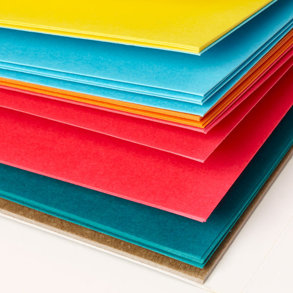
Our Uglypads Earth Tones pad is 25 sheets, five colors, five sheets each. Each color is chosen for a specific kind of subject.
Warm beige. The most versatile. Works for most skin tones and most landscapes. If you only use one sheet per session, use this.
Clay brown. Deeper than beige. Good for rich landscapes, dramatic portraits, still life with dark objects.
Ochre. Golden, almost yellow-orange. Great for autumn subjects, warm light, sunset and dusk work.
Sage green. The wildcard. Beautiful for botanical subjects, dense landscape, and portraits where you want a cooler midtone.
Slate gray. The traditional classical choice. Good for architectural subjects, overcast landscapes, and value studies.
Media that work on earth tones
Earth tones are the most media-forgiving palette we make. They take almost everything well.
Graphite pencil. Excellent. The pencil reads naturally and the paper provides the midtone.
Charcoal. Excellent for dramatic value studies. Especially on slate gray.
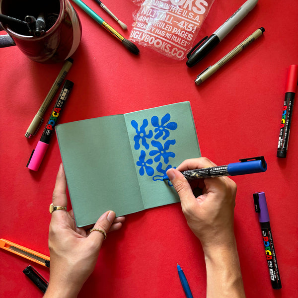
Colored pencil. The best combination in the plan. Layer naturally, add a white or light pencil for highlights, and the paper does the middle value for you.
Conte and pastel pencil. Classical combination — sanguine or black Conte plus white chalk on a warm earth tone is how master drawings have been made for 500 years.
Gouache. Works beautifully. Earth tones flatter gouache better than white does.
Where to start
If you've never worked on colored paper before, earth tones are the place to start. They're forgiving, traditional, and don't shock you the way a saturated bright does. If you've worked on white your whole career and want to know what tinted-paper artists have been getting out of it, buy Uglypads Earth Tones and use it for a week instead of your usual sketchbook. The difference will show up fast.