Choosing a colored paper palette isn't about taste — it's about what you're drawing and what media you're using. A magenta sheet is perfect for one kind of work and useless for another. Here are the three palette families, what each one is actually good for, and which of our Uglypads collections maps to which.
The three palette families
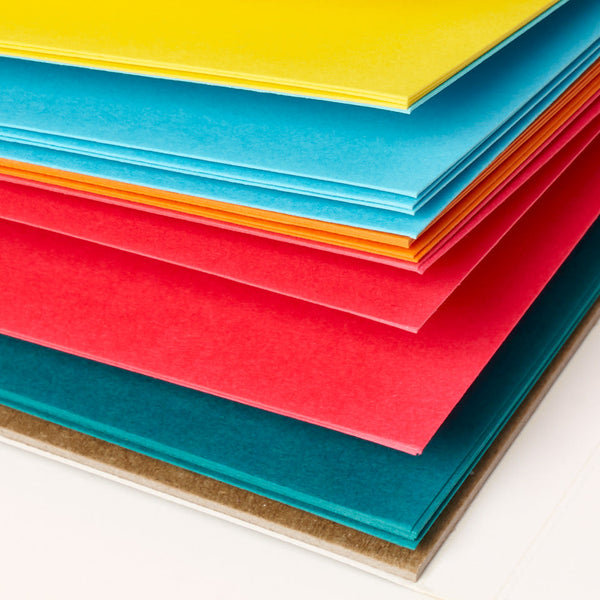
Most colored paper falls into one of three groups: brights, pastels, and earth tones. Each one has a different purpose, a different aesthetic, and a different set of media it plays well with. We built our Uglypads line around all three because no single palette serves every kind of work.
Brights
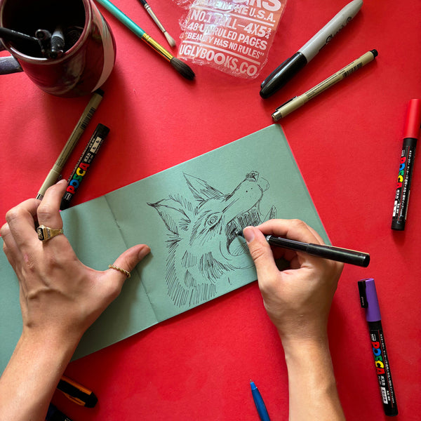
Brights are high-saturation colors — electric orange, magenta, lime, cobalt, cadmium yellow. They're the least forgiving palette, because they demand confident mark-making. You can't hide in subtle tonal shifts on a bright ground — every mark has to commit to something.
Best for
-
Graphic illustration and design work.
-
Ink drawing — especially brush pens and fineliners.
-
Marker work where high contrast is the point.
-
White pencil or gouache highlights over black linework.
-
Gel pen drawing — opaque whites and metallics pop.
-
Stationery, cards, zines, anything that needs to shout.
Not great for
-
Subtle tonal studies or value work.
-
Portraits with natural skin tones.
-
Landscape and plein air.
-
Anything you want to reproduce or scan for print.
The pad
Uglypads Brights Vol. 1 and Vol. 2 are our two brights-specific pads. Vol. 1 leans warmer, Vol. 2 leans cooler. Between them you get ten distinct vivid colors — more brights variety than anyone else in the category offers, mostly because the other major brands still build for pastel artists and pastel artists don't buy brights.
Pastels
Pastels are pale, soft colors — powder pink, mint, lavender, butter yellow, soft peach. They hold color without overwhelming it. The opposite of brights: forgiving, gentle, flattering to subtle work.
A note on the word "pastel"
"Pastel paper" has two meanings and they get confused constantly. It can mean paper made for pastel artists (chalk pastels) — usually textured and in muted grays, tans, and creams. Or it can mean paper that's itself pastel-colored — pale pinks, mints, lavenders. Canson, Fabriano, and Strathmore's "pastel paper" is the first kind. Our Uglypads Pastels is the second kind. If you want actual pastel colors, you want the second kind, and that's where we come in.
Best for
-
Portrait studies, especially children or soft subjects.
-
Botanical illustration.
-
Colored pencil work with a delicate touch.
-
Stationery and paper goods design.
-
Anything that needs to feel calm, quiet, or gentle.
Not great for
-
High-contrast graphic work.
-
Heavy ink or marker that would swamp the softness.
-
Value studies that need a strong midtone.
The pad
Uglypads Pastels is a single pad of five pastel colors. It's the pad you reach for when you want color that steps back instead of shouting.
Earth tones
Earth tones are the traditional artist palette — warm beiges, clay browns, ochres, sage greens, slate grays. The colors of actual ground, rock, bark, and stone. They give you a natural midtone that makes both highlights and shadows more intentional.
Best for
-
Landscape and plein air.
-
Still life, especially natural subjects.
-
Portraits — especially warm skin tones.
-
Classical drawing practice and value studies.
-
Travel sketching and urban sketching.
-
Anyone trying colored paper for the first time.
Not great for
-
Graphic work that needs high contrast.
-
Color studies where you need a neutral ground.
The pad
Uglypads Earth Tones is the most traditional pad we make — five earth-tone colors built for landscape, still life, and portrait work. It's the easiest of our pads to start with if you've never worked on colored paper.
A simple decision tree
If you're still stuck, here's how to decide in 30 seconds:
-
Graphic, bold, ink-and-marker work → Brights Vol. 1 or Vol. 2
-
Soft, gentle, portrait or botanical → Pastels
-
Landscape, still life, classical → Earth Tones
-
First time working on colored paper → Earth Tones
-
Already work on white and want maximum shock → Brights Vol. 1
The other answer: try all four
Most working artists end up rotating between palettes depending on what they're making that week. Our line is built to be combined — the Brights pads share a saturation logic, the Pastels and Earth Tones share a softness. Different subjects want different palettes, and the fastest way to find what you actually like is to try more than one.