Saturated paper isn't for everyone. It's loud. It's decisive. It kills subtle tonal work and punishes anyone who wants to hide in careful shading. But for the artists and designers who actually need it — ink illustrators, gel pen users, gouache painters, zine-makers, graphic designers — nothing else works as well. Here's why saturation matters and what to do with it.
What bright paper actually is
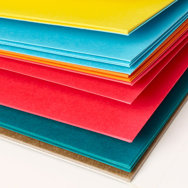
Bright paper is colored paper at the high-saturation end of the spectrum. Electric orange, magenta, lime green, cobalt, cadmium yellow. The colors you'd get from running pure pigment through the pulp at the highest concentration. Not muted, not toned down — as intense as the paper fibers will hold.
Most colored paper brands don't make brights because their customer base doesn't want them. Canson Mi-Teintes, Fabriano Tiziano, and Strathmore all built their reputations on pastel artists and classical drawing students, both of whom want muted midtones. Brights are for a different customer — one who's showed up more recently and grown fast.
Who actually uses brights
Graphic illustrators. High-contrast ink on a saturated ground is the visual language of zine culture, punk design, and contemporary illustration.
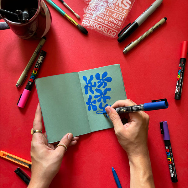
Gel pen artists. White, gold, silver, and neon gel pens were made for this. They pop on saturated paper in a way they never do on white.
Gouache painters. Opaque gouache covers a saturated ground beautifully — you get the rich color beneath wherever you leave paper showing.
Designers and stationery makers. Product work that needs to signal energy, youth, and confidence.
Students in contemporary art and design programs. Where the aesthetic has shifted in the last 15 years from tonal drawing to graphic-forward work.
Anyone whose sketchbook is too precious. Bright paper forces looseness. You can't make a "careful" drawing on magenta — the paper won't let you.
Media that pop on brights
Best
Black ink (fineliner, brush pen, dip pen) — maximum contrast.
White and opaque pastel gel pens — the single most underrated combo.
White or metallic colored pencils — especially Prismacolor Premier white.
Gouache — any color, but white highlights especially.
Permanent marker — for quick graphic work.
Paint markers — Posca, Molotow, etc.
Decent
Graphite pencil — works but reads faint. Better as a sketch underlayer than a finished medium.
Colored pencil in strong, opaque colors — layering helps build opacity.
Don't bother
Light graphite work that you want to photograph or scan.
Subtle colored pencil tonal shifts.
Anything transparent — watercolor-style washes on bright paper just disappear into the ground.
How brights change your process
Here's what actually happens when you start drawing on bright paper. You stop second-guessing. You can't — the paper is already doing so much visually that any hesitation in your mark-making reads as tentative against a confident ground. Your line work gets bolder. Your compositions simplify. You stop trying to make the drawing tonally "right" and start making it graphically interesting.
This is the opposite of how white paper feels. On white, every mark is a commitment against emptiness — it has to earn its place. On bright, every mark is a response to a statement the paper already made. You're a contributor, not the whole show. For most of us, that's a much easier frame to draw in.
Uglypads Brights Vol. 1 and Vol. 2
We built two separate Uglypads Brights pads because five vivid colors aren't enough. Volume 1 is the warm-leaning set — saturated yellows, oranges, reds, magentas. Volume 2 is the cool-leaning set — electric greens, cyans, blues, purples. Each pad has 25 sheets at 175gsm, five sheets of each of the five colors.
The 175gsm weight matters specifically for bright work. Ink, marker, and gouache are the media most likely to be used on brights, and all three benefit from heavier paper. No bleed-through on double-sided work, no warping under layered media, and the paper holds up to aggressive erasing.
The honest warning
Bright paper is a commitment. You can't half-use it. Every page is going to be vivid, high-contrast, loud. If that's what you want, nothing else delivers. If it's not what you want, don't buy brights and then wish they were softer.
If you're unsure, start with one Brights pad and one Earth Tones pad. Use them in rotation for a month. You'll know pretty fast which one matches how you actually draw.