Colored paper isn't a trend. Artists have been preferring a tinted ground to white since at least the 15th century, and the reasons haven't changed: a colored page saves you from rendering the midtone, flatters your subject, and lowers the psychological stakes of the blank surface. This is the short history of how we got here — from silverpoint on prepared paper to saturated magenta pads.
The medieval workaround
The earliest artists working on colored grounds weren't using pre-colored paper. They were preparing white paper themselves — brushing on a wash of pigment mixed with bone dust, gum, and water. The technique was called preparation. The paper came out gray, blue, red, or ochre, and the goal was practical: create a midtone ground that silverpoint could actually show up on.
Silverpoint — drawing with a silver stylus — produces a line too faint to read on white paper. Artists needed a tinted ground to see what they were doing. So they made one. The recipes are documented in Cennino Cennini's Il Libro dell'Arte (c. 1400), which gives instructions for tinted grounds in blue, green, and flesh tones. This is where the story starts.
Renaissance refinement
By the 15th and 16th centuries, prepared colored paper was a drawing standard across Italy and Northern Europe. Leonardo da Vinci, Raphael, and Albrecht Dürer all produced major drawings on prepared blue or tinted paper, using white chalk or lead white to build highlights against the midtone ground.
This is where the fundamental logic of toned paper locks in: the paper is the middle value, black chalk or ink is the shadow, white chalk is the highlight. Three values, rendered fast. The approach was so efficient it became the default for figure studies, portrait sketches, and preparatory drawings for the next several hundred years.
18th century: pastel paper enters
The 18th century brought two things: industrial paper manufacture, and the pastel boom. Rosalba Carriera in Venice and Maurice Quentin de La Tour in France were producing pastel portraits on a scale that made prepared paper impractical. Papermakers responded with paper that was already dyed — color introduced at the pulp stage, so every sheet came out of the mill tinted.
Most of that paper was made in France and Italy. Palettes were muted — grays, tans, blues — because the intended use was still classical: pastel and chalk work where a midtone ground was practical, not expressive. This is the tradition that still dominates Canson Mi-Teintes and Fabriano Tiziano. Both are direct descendants of 18th-century pastel paper, and their color logic hasn't fundamentally changed since.
19th century: industrial color
Two papermakers defined the modern colored paper category, and both are still making paper today.
Canson
Canson traces its founding to 1557 in Annonay, France, through the Montgolfier family — the same Montgolfiers who launched the first hot air balloon in 1782. The Mi-Teintes paper line was introduced in 1905 but it's based on 19th-century pastel paper formulas. The name means "half-tones" in French, which tells you exactly what it was designed for.
Fabriano
Fabriano is older. The Italian mill has been making paper since 1264 and counts Michelangelo and Beethoven among its historical customers. The Tiziano colored paper line is relatively modern but it sits on 750 years of papermaking tradition. Like Mi-Teintes, Tiziano's palette logic is rooted in pastel and classical drawing.
20th century: Strathmore and the American sketchbook
American paper came to colored paper later and from a different angle. Strathmore, founded in 1892 in Massachusetts, built its reputation on fine drawing papers for commercial illustrators and students. The Strathmore Toned Sketch line — toned gray, tan, and blue — became the default American toned paper for most of the 20th century.
Strathmore's palette was even more restrained than Canson's. Three colors: warm gray, tan, cool gray. Built for value studies in academic drawing programs. Functional, unshowy, widely available. If you took a drawing class in an American art school between 1950 and 2010, odds are you used Strathmore toned paper.
The pocket format problem
Through all of this — five centuries of colored paper, four major brands — nobody was making colored pocket notebooks. Colored paper was studio paper. Pads. Large sheets. For easel work or classroom use. The pocket sketchbook — the one you carry in your bag — stayed overwhelmingly ivory, cream, or white.
Moleskine revived the pocket notebook in the late 1990s using ivory paper. Leuchtturm1917, their German rival, went with white or ivory. Field Notes, the American craft brand that launched in 2008, chose white. None of them has ever put a colored-paper pocket notebook on their core lineup.
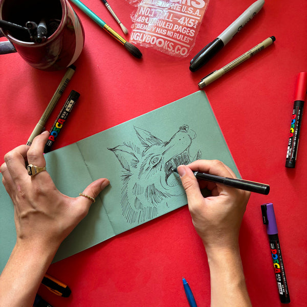
That was the gap we started Uglybooks to fill. Pocket-size sketchbooks with colored pages — every page tinted, 48 pages per book, pocket and landscape sizes — didn't exist as a mainstream option until we made them.
The 2020s: the vivid turn
The most recent shift in colored paper is about palette. The classical tradition was muted — grays, tans, soft blues, bone. The pastel tradition was pale — pinks, mints, cream. Neither tradition produced saturated brights, because neither customer base wanted them. Pastel artists want muted grounds. Classical drawing students want neutrals.
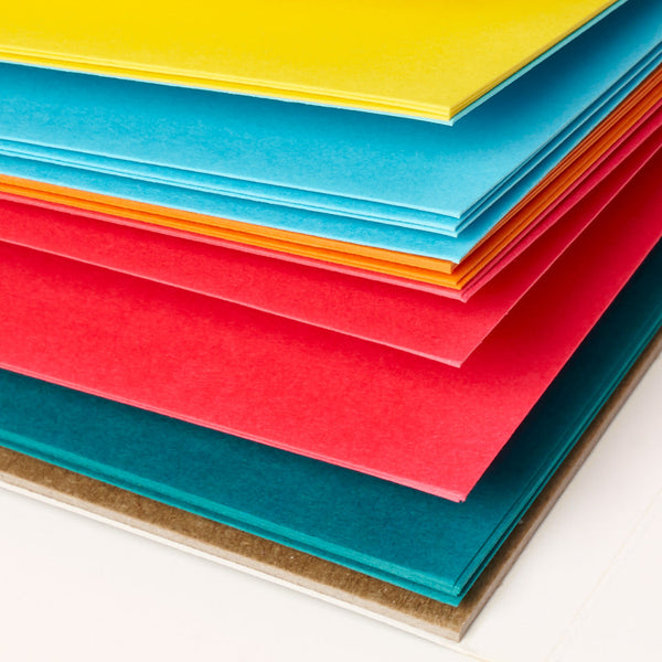
But a newer customer base — graphic illustrators, zine-makers, colored pencil artists, stationery designers, urban sketchers — wants bright. Saturated orange, electric green, cobalt, magenta. These colors have always existed in construction paper and cardstock, but not in archival drawing paper at real weights. That's what's new in the 2020s, and it's what our Uglypads Brights Vol. 1 and Vol. 2 are built around.
The lineage
We sit at the end of a very long line. Our 135gsm pocket sketchbooks are a descendant of Renaissance prepared paper, scaled for modern portability. Our 175gsm Uglypads are a descendant of Canson Mi-Teintes and Fabriano Tiziano, rebuilt around saturated color. Our 175gsm Uglysheets are a direct competitor to the large-format loose sheets that have been the studio standard for 200 years.
What's changed isn't the weight, the format, or even the idea of dyeing paper at the pulp stage. What's changed is the palette, the customer, and the context. A magenta page in a pocket sketchbook in 2026 does the same thing a prepared blue page did in 1500: gives you a midtone, removes the blank-page problem, invites you to make a mark. Everything else is details.
Every colored page is a conversation with every artist who drew on one before you. That's a long conversation, and it's still going.