If you've ever bought a "colored" or "assorted" paper pad expecting color and opened it to find four sheets of white and champagne staring back at you, you're not alone. The colored paper industry has been building around pastel artists for 100 years, which means most "assorted" pads include neutrals that function as highlights for that specific use case. If you want actual color, you have to look somewhere else. Here's where.
Why most colored pads include white
It's not a scam. It's a legacy. Pastel artists — people working with chalk pastels, where you start on a midtone ground and build up in both directions — use white or near-white paper as a highlight base. When Canson, Fabriano, and Strathmore designed their "assorted" pads in the 20th century, they were building for that customer. Six colors per pad, with one of them being white or near-white, made sense when the intended use was chalk pastel on a value range.
The problem is that this design logic hasn't changed, even though the customer base has. If you're a graphic illustrator, a colored pencil artist, a designer working in gouache, a zine-maker, or an art teacher trying to fill a classroom — you don't want white. You wanted color. The pad you bought doesn't deliver that.
Who this frustrates
The same group of customers keeps running into this wall:
Graphic illustrators and designers. They want saturated grounds for ink and marker work. White in the pad is dead weight.
Colored pencil artists. They want color variety to match subjects. The "assorted" logic doesn't serve them.
Educators. Students expect color. Half the pad being neutral is half the lesson lost.
Stationery and paper-goods makers. They need usable color for products. White sheets go in the scrap bin.
Anyone buying their first colored pad. They don't know the convention yet. They're disappointed.
What's actually out there
Here are the options that actually deliver color across the whole pad.
Uglypads Brights Vol. 1 and Vol. 2
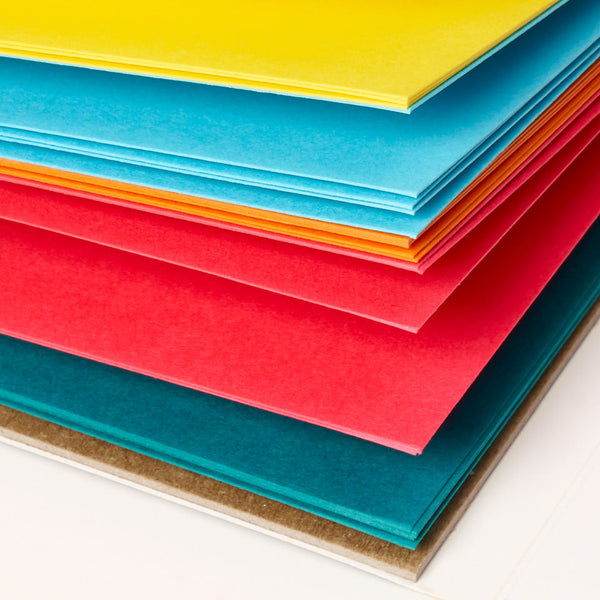
Our two bright collections. Vol. 1 leans warmer (think cadmium yellow, orange, red, magenta), Vol. 2 leans cooler (green, cyan, blue, purple). Five colors per pad, five sheets each, 25 sheets total at 175gsm. Zero white. Zero champagne. Zero moonstone. Every sheet is saturated.
Uglypads Pastels
If you want soft colors instead of brights, this is the other all-color pad. Actual pastel-hued paper — pale pink, mint, lavender, butter yellow, soft peach. Again, five colors, five sheets each, no muted neutrals.
Uglypads Earth Tones
For landscape and natural subjects. Warm beiges, ochres, clay browns, sage greens, slate grays. Still color — just muted color, not white or champagne. If you want the traditional midtone palette but actually want it to be colored, this is the pad.
Canson Mi-Teintes single-color sheets
If you specifically want Canson paper but don't want the "assorted" logic, you can buy individual colors as loose sheets at most art supply stores. More expensive per sheet, but you get exactly the color you want.
Daler-Rowney Canford
Their loose sheet range is the broadest in the industry — 50+ distinct colors. But they don't do a vivid pad the way our Brights line does. Better for custom mixing than grabbing one curated pad.
A note on construction paper
Don't. Construction paper is all-color and cheap, but it's not archival. The colors fade within months of light exposure, and the paper will yellow and become brittle. If you want something that lasts — especially for work you'd scan, sell, or frame — you need acid-free pigmented paper, not dyed pulp.
The simplest answer
If you want a colored paper pad where every sheet is color, buy Uglypads. That's what we built them for.
This isn't just a sales pitch. It's the only honest answer I can give to a question that comes up constantly. The mainstream pads have a 100-year head start on distribution and brand recognition, but none of them solve the "I want color, all of it, all the time" problem. That's what we built Uglypads to solve.